
Elementor, GSAP, Scrolltrigger
So erstellst du eine horzontale Scroll Animation in Elementor (Free and Pro)
SHARE
SHARE
Horizontale Scrolling-Effekte können eine gewöhnliche Webseite in ein interaktives Storytelling-Erlebnis verwandeln. Ob Zeitstrahl, Portfolio oder Panorama – diese Technik verleiht deiner Website einen professionellen Touch. In dieser Anleitung zeige ich dir Schritt für Schritt, wie du den Horizontal-Scroll-Effekt mit Elementor umsetzt – sowohl mit der kostenlosen als auch mit der Pro-Version.
Der horizontale Scrolleffekt basiert auf einer bestimmten Container-Struktur:
Der Haupt-Scroll-Container braucht spezifische Einstellungen für beste Performance:
Der Scroll-Content-Container dient als Wrapper für deine horizontalen Panels:
Jedes horizontale Panel braucht folgende Einstellungen:
Die Animation basiert auf GSAP (GreenSock Animation Platform) mit ScrollTrigger:
Das Setup bietet einige Optionen zur Feinabstimmung:
Damit alles rund läuft, solltest du Folgendes beachten:
Weitere Animationen können innerhalb von ScrollTrigger integriert werden
Für optimale Performance:
Fazit
Diese horizontale Scroll-Animation bringt richtig Power in deine Website! Zugegeben: Die Einrichtung braucht etwas Liebe zum Detail – aber das Ergebnis ist ein professionelles, flüssiges Scroll-Erlebnis, das die Nutzerbindung ordentlich pusht. Und das Beste: Du brauchst keine extra Plugins – egal, ob du Elementor Free oder Pro verwendest.
Dank der hohen Flexibilität eignet sich dieser Effekt perfekt für Storytelling, Produktpräsentationen oder kreative Portfolios – und bleibt dabei voll kompatibel mit beiden Elementor-Versionen.
Place the HTML Widget as the last item in your Scroll Container and add this code there or in the Elementor Custom Code
<script src="https://cdn.jsdelivr.net/npm/gsap@3.12.5/dist/gsap.min.js"></script>
<script src="https://cdn.jsdelivr.net/npm/gsap@3.12.5/dist/ScrollTrigger.min.js"></script>

<script>
  gsap.registerPlugin(ScrollTrigger);

  let container = document.querySelector(".scroll-content");
  let scrollContainer = document.querySelector(".scroll-container");

  // Timeline for horizontal scrolling and parallax effects
  let scrollTimeline = gsap.timeline({
    scrollTrigger: {
      trigger: scrollContainer,   // The element that will trigger the scroll animation
      pin: true,                  // Pins the element, making it fixed while scrolling
      scrub: 1,                   // Syncs the animation with the scroll position
      start: "top top",           // Animation starts when the top of scrollContainer meets the top of the viewport
      end: () => "+=" + container.scrollWidth,  // Sets the end point based on the width of the scroll-content
      markers: false,              // Optional, adds markers to visualize the start and end points for debugging
      invalidateOnRefresh: true   // Refreshes the end position on window resize for responsive adjustments
    }
  });

 // Add a small delay at the start (pause with no movement)
scrollTimeline.to(container, { x: 0, duration: 0.1 });

// Add Horizontal Scroll to Timeline
  scrollTimeline.to(container, {
    x: () => -(container.scrollWidth - window.innerWidth) + "px",
    ease: "none"
  });

// Add a small delay at the end
scrollTimeline.to(container, { x: () => -(container.scrollWidth - window.innerWidth) + "px", duration: 0.1 });
</script>
.scroll-container{
    transition: none;
    overscroll-behavior: none;
    display:flex !important;
    width:100% !important;
    Height: 100vh !important;
    overflow: hidden !important;
    margin: 0px !important;
    padding: 0px !important;
}


.scroll-content{
    transition: none;
    overscroll-behavior: none;
    display:flex !important;
    width: auto !important;
    height: 100vh !important;
  flex-wrap: nowrap !important;
  gap: 0 !important;
  flex-direction: row !important;
  margin: 0 !important;
  padding: 0 !important;
}


.panel {
  display: flex !important;
  width: 100vw !important;
  height: 100vh !important;
  flex-grow: 1 !important;
  flex-shrink: 0 !important;
  flex-basis: auto;
  box-sizing: border-box !important;
}
Follow exactly the same steps for the setup instead of adding the CSS Codes from Above. The CSS Code will be in the following code in the Styles included. You can also add the CSS Code to your wordpress Custom CSS and add the GSAP Code in the HTML Widget.
Or just copy all the code below and this into the HTML widget.
<style>
   .scroll-container{
    transition: none;
    overscroll-behavior: none;
    display:flex !important;
    width:100% !important;
    Height: 100vh !important;
    overflow: hidden !important;
    margin: 0px !important;
    padding: 0px !important;
}

.scroll-content{
    transition: none;
    overscroll-behavior: none;
    display:flex !important;
    width: auto !important;
    height: 100vh !important;
   flex-wrap: nowrap !important;
   gap: 0 !important;
   flex-direction: row !important;
   margin: 0 !important;
   padding: 0 !important;
}

.panel {
  display: flex !important;
  width: 100vw !important;
  height: 100vh !important;
  flex-grow: 1 !important;
  flex-shrink: 0 !important;
  flex-basis: auto;
  box-sizing: border-box !important;
}

</style>


<script src="https://cdn.jsdelivr.net/npm/gsap@3.12.5/dist/gsap.min.js"></script>
<script src="https://cdn.jsdelivr.net/npm/gsap@3.12.5/dist/ScrollTrigger.min.js"></script>

<script>
  gsap.registerPlugin(ScrollTrigger);

  let container = document.querySelector(".scroll-content");
  let scrollContainer = document.querySelector(".scroll-container");

  // Timeline for horizontal scrolling and parallax effects
  let scrollTimeline = gsap.timeline({
    scrollTrigger: {
      trigger: scrollContainer,   // The element that will trigger the scroll animation
      pin: true,                  // Pins the element, making it fixed while scrolling
      scrub: 1,                   // Syncs the animation with the scroll position
      start: "top top",           // Animation starts when the top of scrollContainer meets the top of the viewport
      end: () => "+=" + container.scrollWidth,  // Sets the end point based on the width of the scroll-content
      markers: true,              // Optional, adds markers to visualize the start and end points for debugging
      invalidateOnRefresh: true   // Refreshes the end position on window resize for responsive adjustments
    }
  });

 // Add a small delay at the start (pause with no movement)
scrollTimeline.to(container, { x: 0, duration: 0.1 });

// Hinzufügen des horizontalen Scrollens zur Timeline
  scrollTimeline.to(container, {
    x: () => -(container.scrollWidth - window.innerWidth) + "px",
    ease: "none"
  });

// Add a small delay at the end
scrollTimeline.to(container, { x: () => -(container.scrollWidth - window.innerWidth) + "px", duration: 0.1 });
</script>

ich bin Sabine – Webdesignerin und WordPress-Expertin. Ich entwickle professionelle Websites, die technisch überzeugen und deine Business-Ziele unterstützen.

Damit du ohne Umwege zu deiner Website kommst, habe ich dir die 5 wichtigsten Tipps zusammengestellt. So sparst du wertvolle Zeit und Geld!
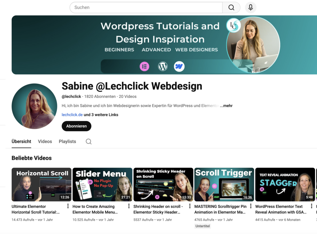
Besuche meinen Youtube Channel und entdecke interessante Tipps, wie du Animationen erstellst sowie weitere Tipps rund um Elementor und Webdesign.
…lies diese 5 Planungs-Tipps, die Selbständige & Coaches tausende Euro kosten


